
CoreStack Reports
Reports Overview
The CoreStack Reports console provides user-configurable views of your cost, operations, and security details with insightful reports. Different reports are available for your analysis across all the OSCAR pillars.
This document explains the different types of reports available in CoreStack and how they work, in order to help organizations best utilize them.
Paginated Analytics Reports
Paginated Analytics Reports are the OSCAR Governance Assessment Reports. These are built like PDF reports and are rendered with the help of analytics tools. You can select relevant values for Tenants, Cloud Accounts, and Assessment Period to view the report. These reports can only be exported in PDF or Excel format and are triggered on weekly or bi-weekly basis. Users can also trigger these reports on an ad hoc basis.
Below are the different types of paginated analytics reports available in CoreStack:
Cost Governance Reports:
These reports are triggered on a weekly basis and users can run adhoc assessments through the View Settings option for an account on the Account Governance page.
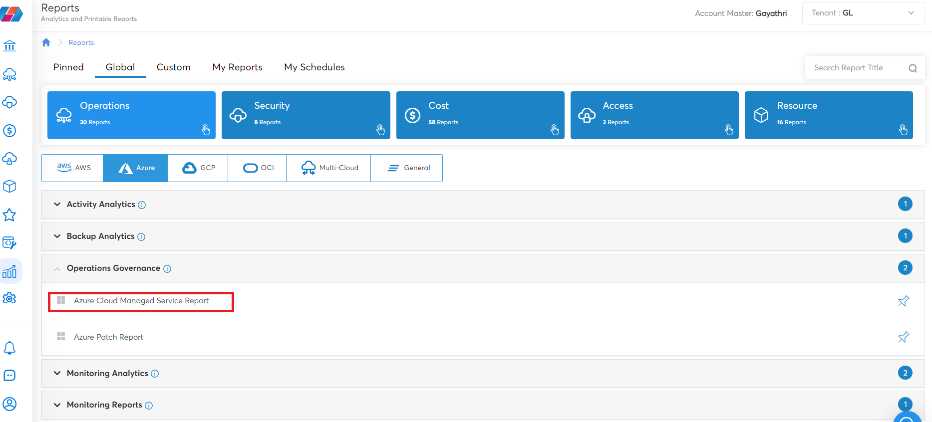
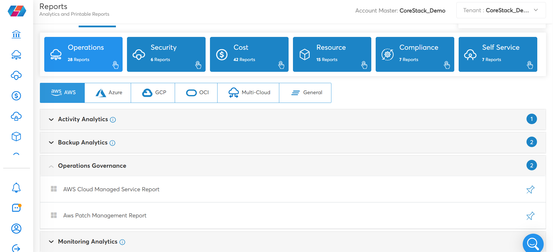
Operations Reports:
These reports run on a fortnightly schedule. Users can export these reports for sharing.
- Azure Operations Governance Reports:
- AWS Operations Governance Reports:
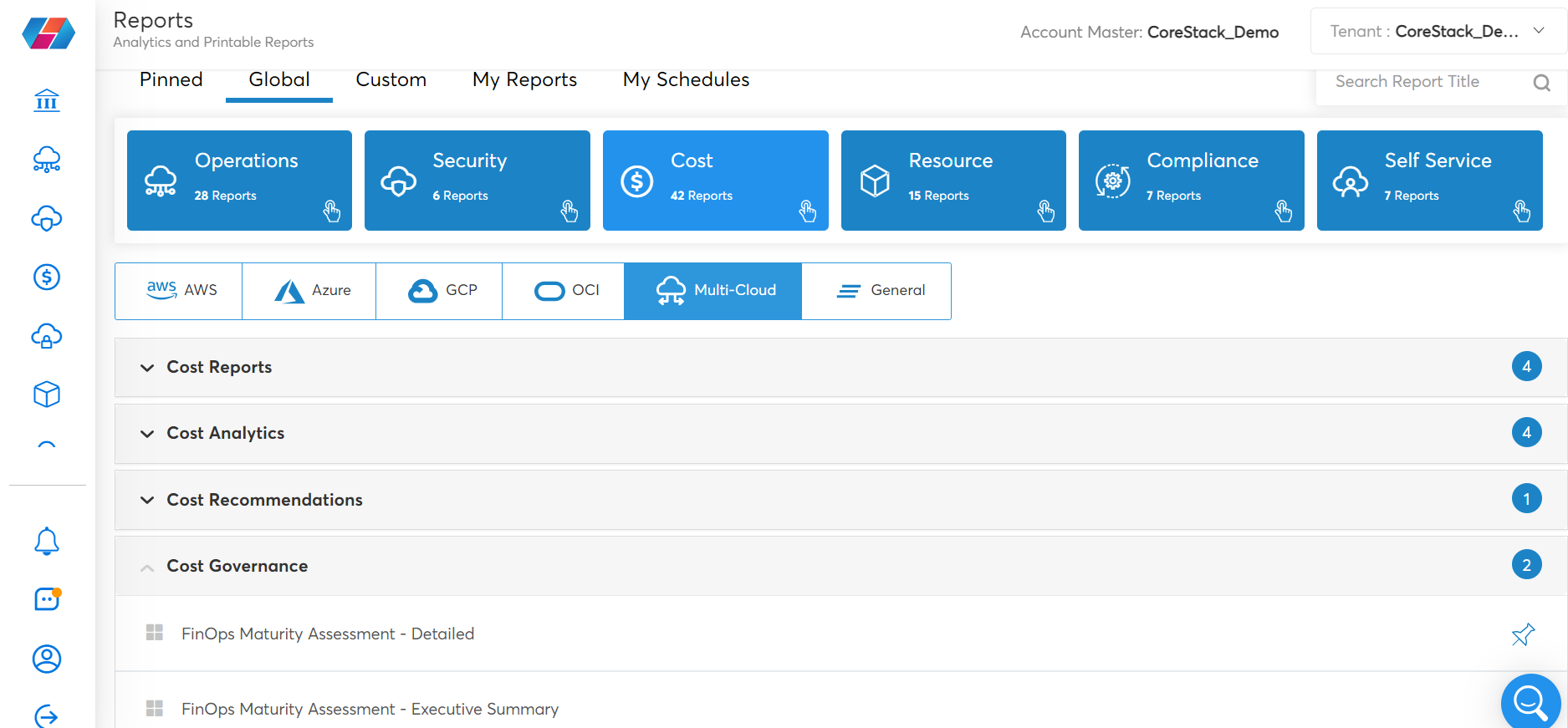
Analytics Reports
Analytics is focused on gaining a deeper understanding of the data. It often involves exploring data at a more granular level to identify patterns and relationships between different data points. Analytical reports provide more detailed information and insights into various aspects of your cloud accounts.
These reports help users to slice and dice the data as per their requirements. The navigation option on the left of the report helps with different views in which the reports can be presented and the Filter section on the right of the screen helps in selecting the required fields and customizing the date range for analytics.
Analytics reports can be shared with users (even if they are not a user of CoreStack) with the help of the Share Report option.
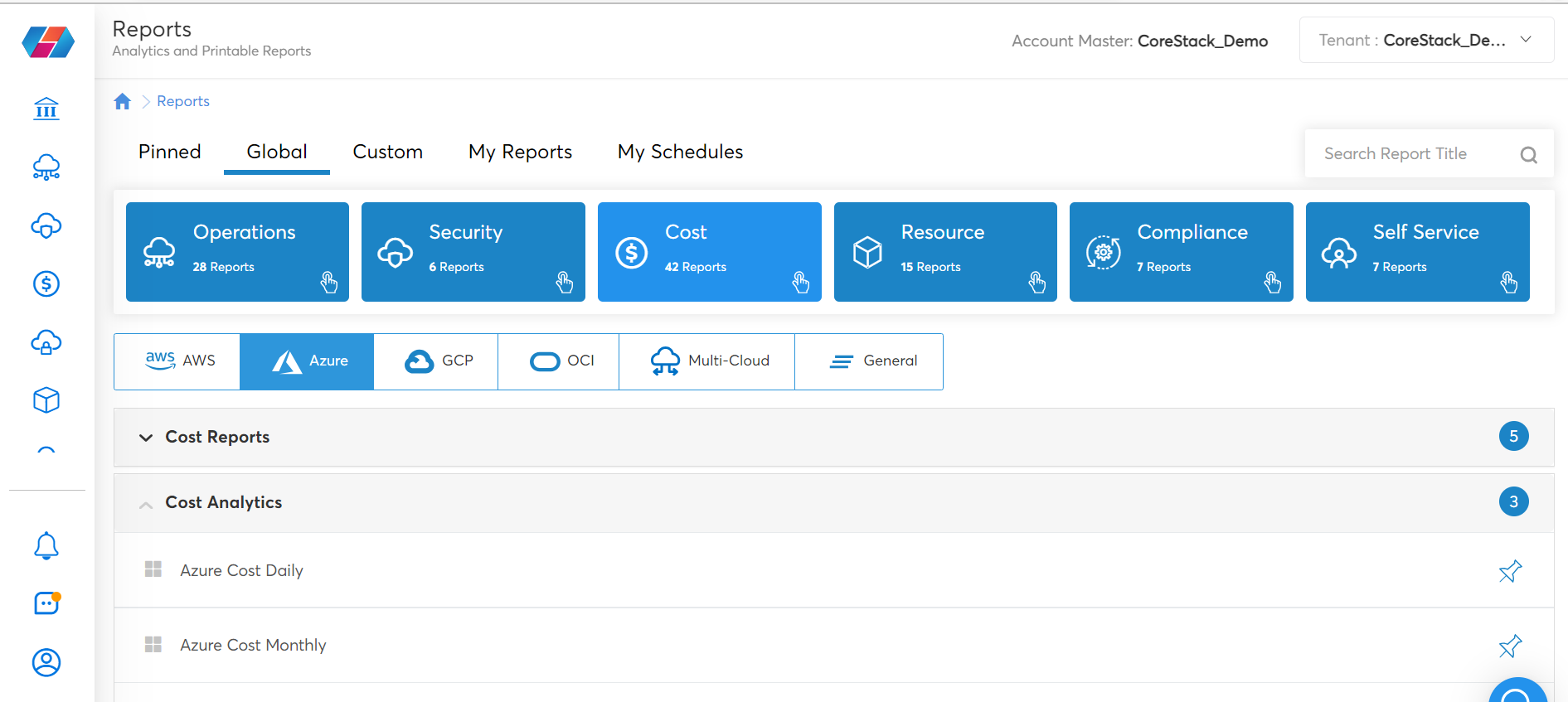
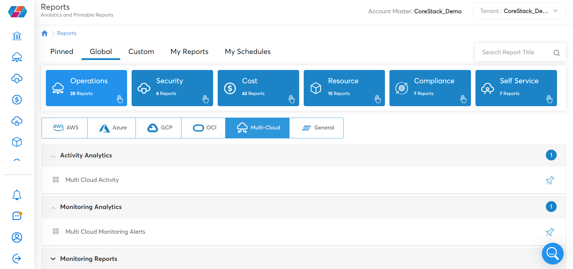
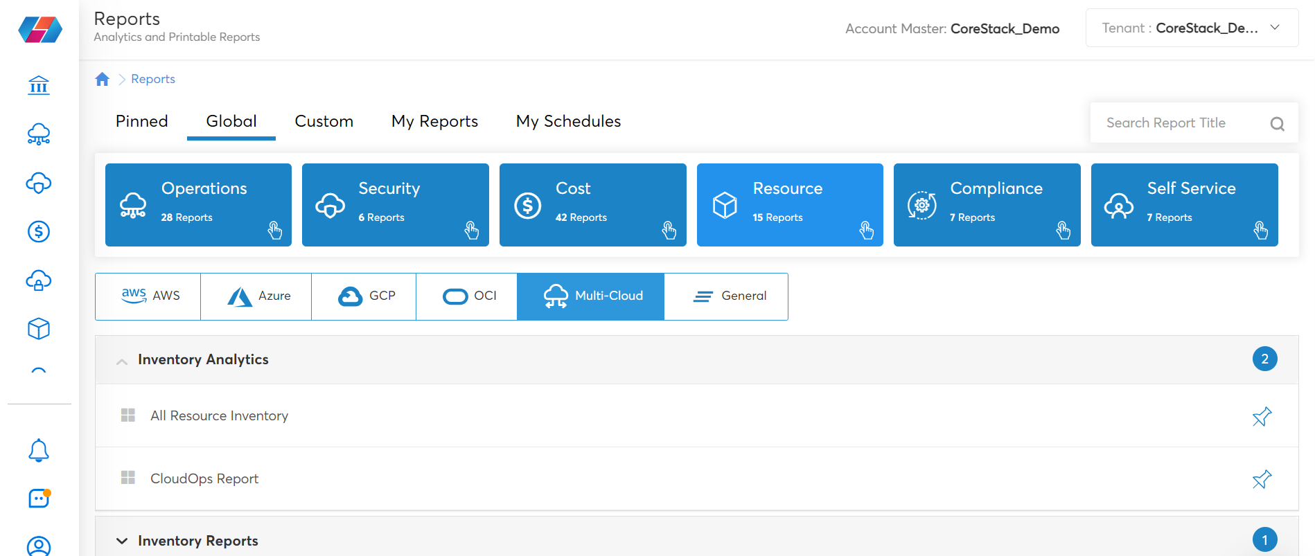
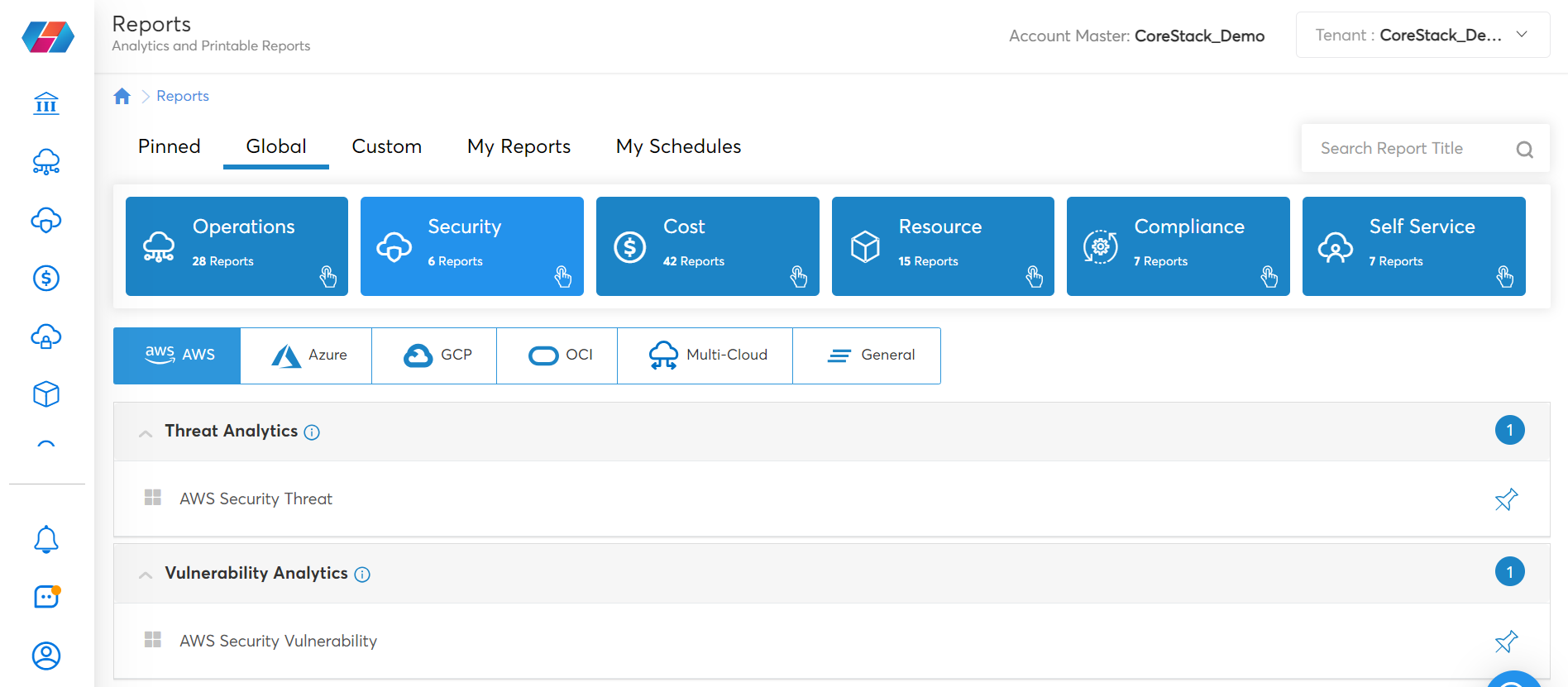
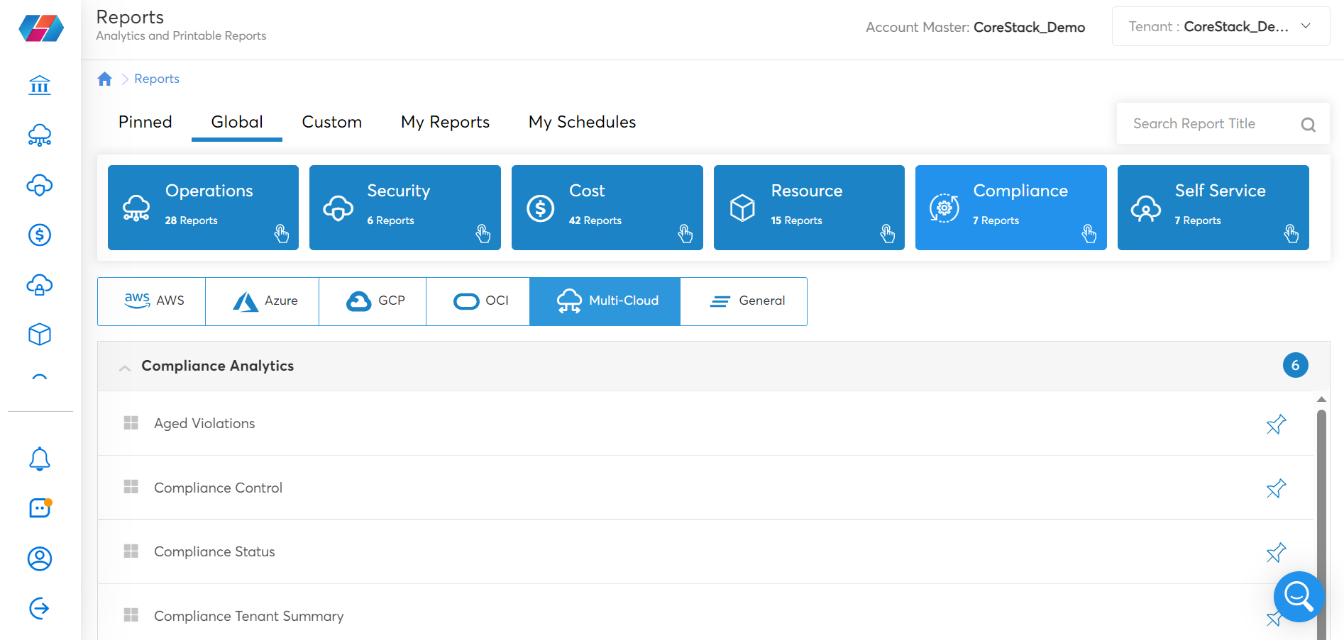
Below are the different Analytics Reports in CoreStack:
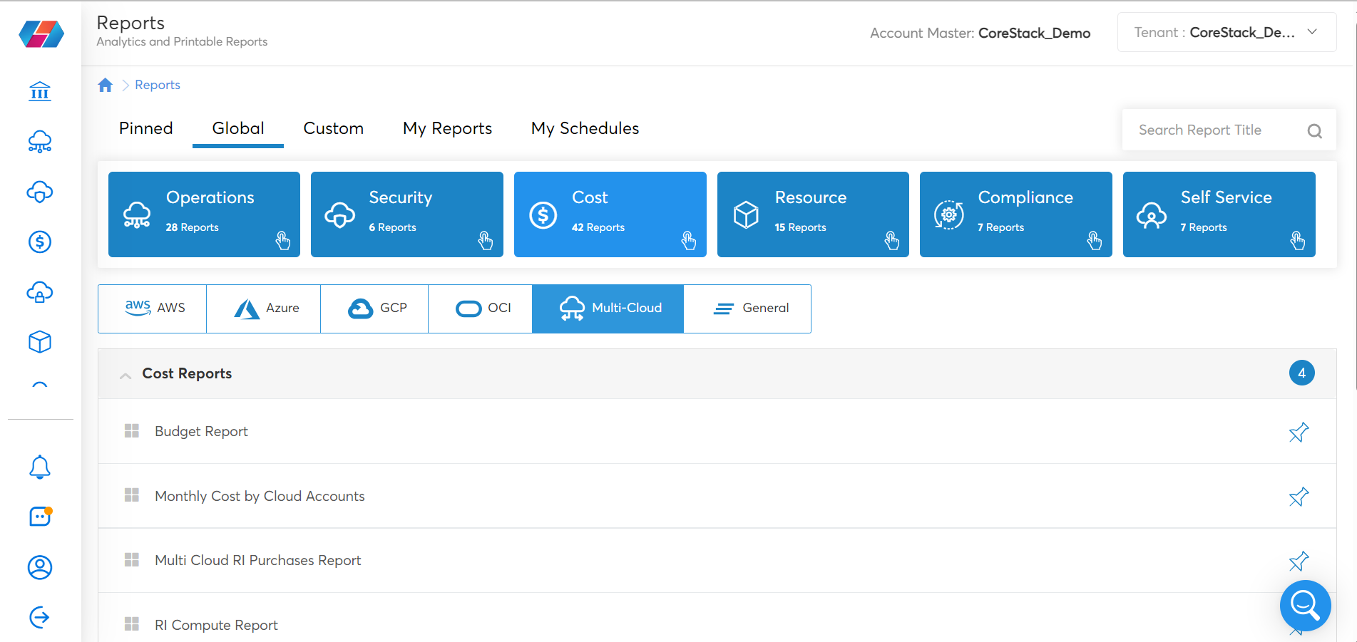
Cost Analytics:
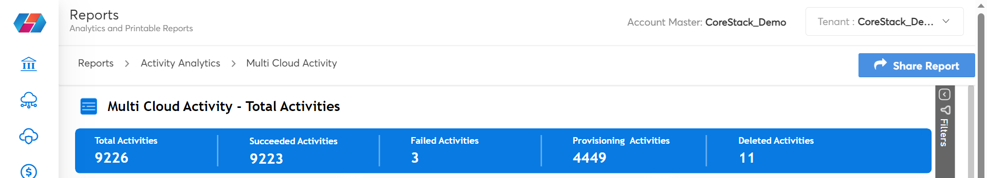
Operations Analytics:
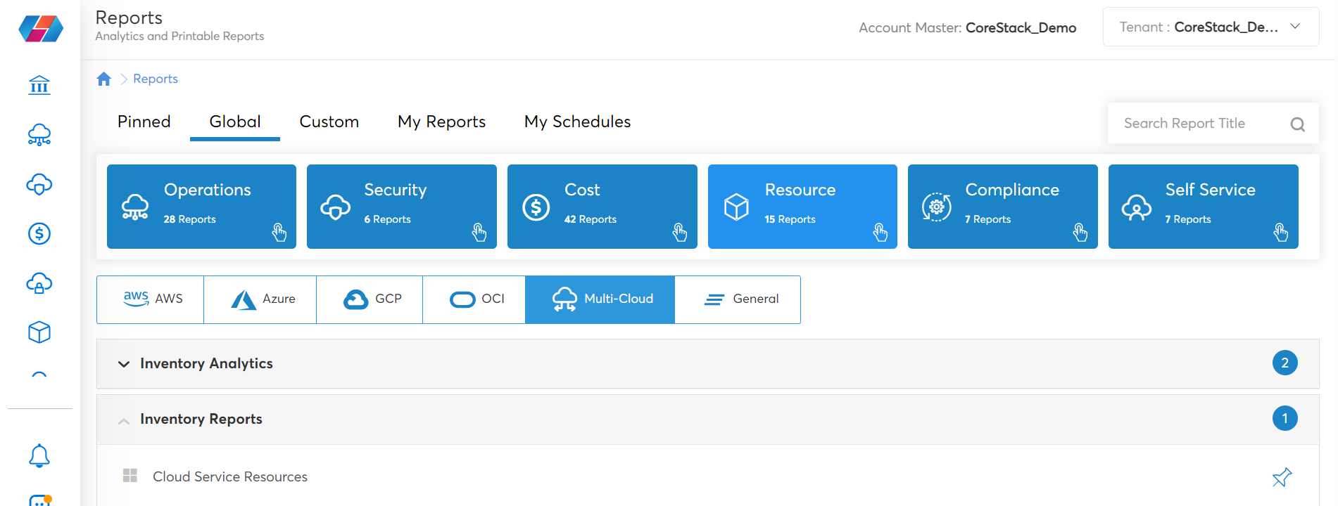
Resource Analytics:
Security Analytics:
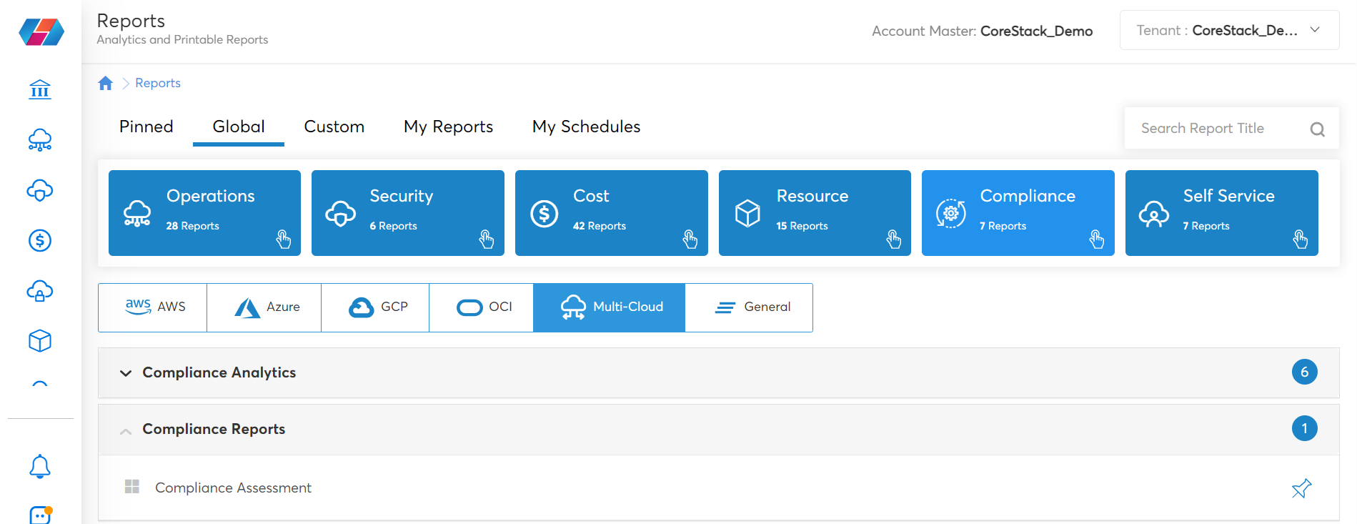
Compliance Analytics:
Paginated SSRS Reports
SSRS stands for SQL Server Reporting Services and is a reporting software that allows you to produce formatted reports with tables in the form of data, graph, images, and charts. These reports are hosted on CoreStack’s server and can be executed anytime using the parameters defined by the users.
These are built like PDF reports and are rendered with the help of SSRS. You can select appropriate values for Tenants, Cloud Accounts, and Assessment Period to view the report. These reports can be exported in a PDF or Excel format and are triggered with point-in-time data. Users can also subscribe to these reports on a daily, weekly, or monthly basis.
Below are the different types of SSRS reports available in CoreStack:
Cost Reports:
Resource Reports:
Operations Reports:

Compliance Reports:
Subscribing to SSRS Reports
Perform the following steps to subscribe to a SSRS report:
-
Access CoreStack and navigate to Reports.
-
Navigate to the report you want to subscribe to.
-
Select the appropriate values for the parameters or fields that show up and click VIEW REPORT.
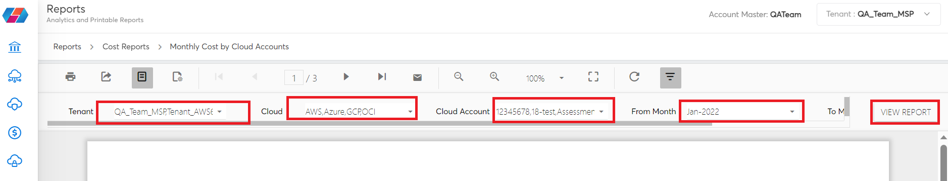
- After the report is generated, click the Subscribe icon.
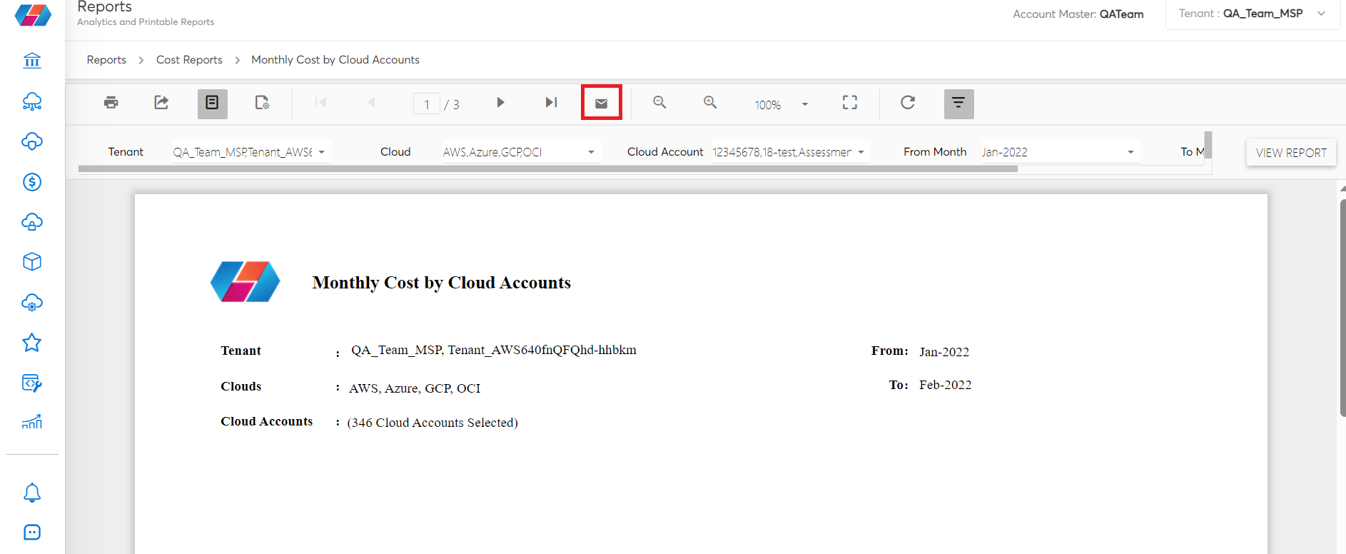
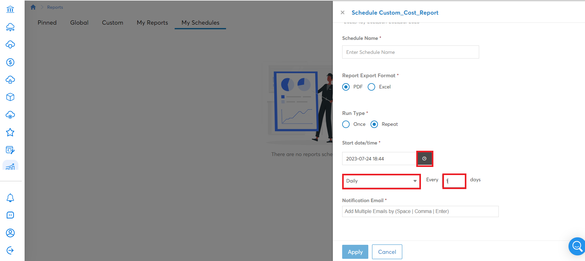
The My Schedules section opens with the scheduling options.
- In the Schedule Name box, type the name of the schedule.
- In the Report Export Format field, select the report format, that is, select either PDF or Excel.
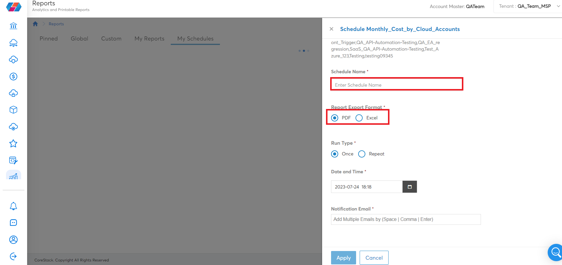
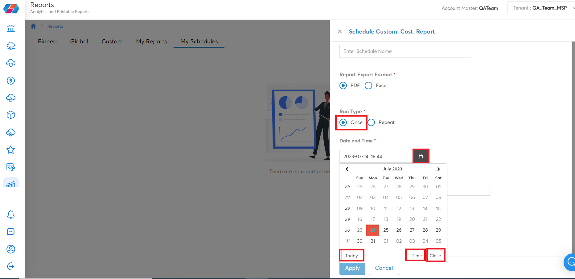
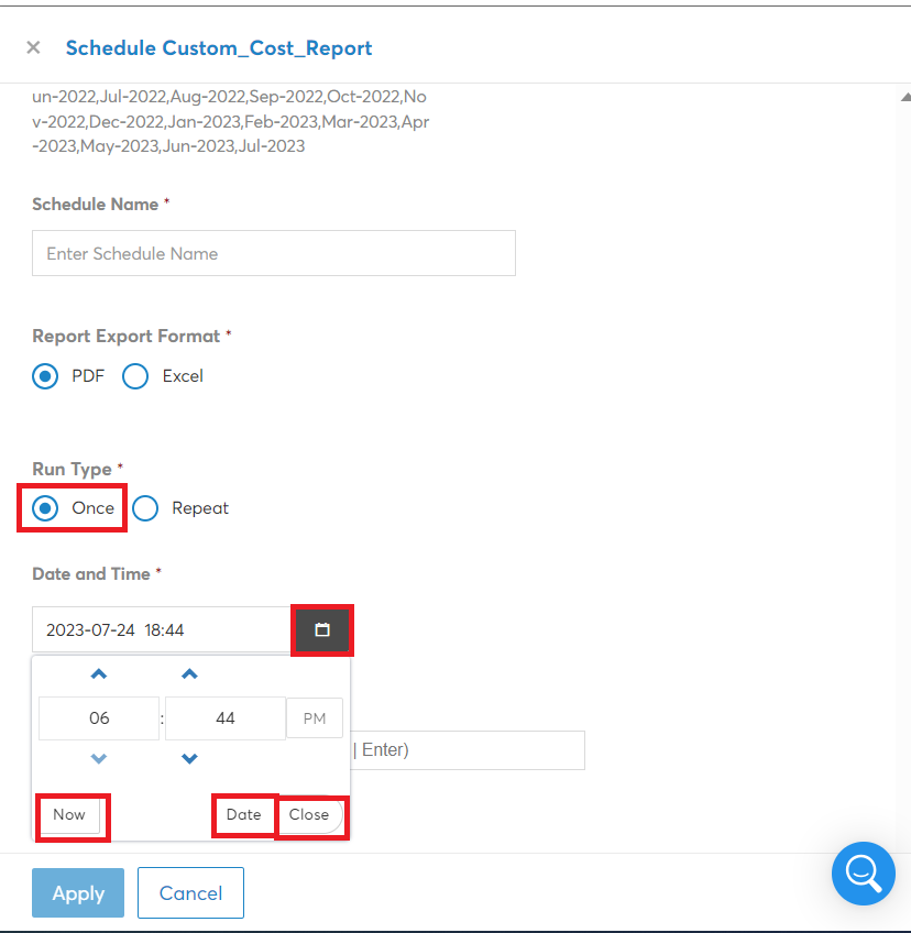
- In the Run Type field, select the frequency at which the report needs to be generated. That is, select either Once or Repeat.
- Select Once if you want the report to be subscribed to only once, and then select the date and time at which it should be triggered.
- Select Repeat if you want to run the report on daily/weekly/monthly basis.
- To fill the date and time, click Start date/time to open the calendar and select a date when the report needs to be triggered, and then select the time.
- In the fields that shows below, select one option from Daily/Weekly/Monthly and in the box at right, type a value as per which the report will be triggered.
Note:
To select the date, click the gray box and select the date, and then select the time when the report needs to be triggered.
- You can switch between Date and Time fields to select correct date and time respectively. For example, click Date to view the calendar and click Time to view the time-related fields.
- Click Now to select the current day’s date and click Close to close the dialog box.
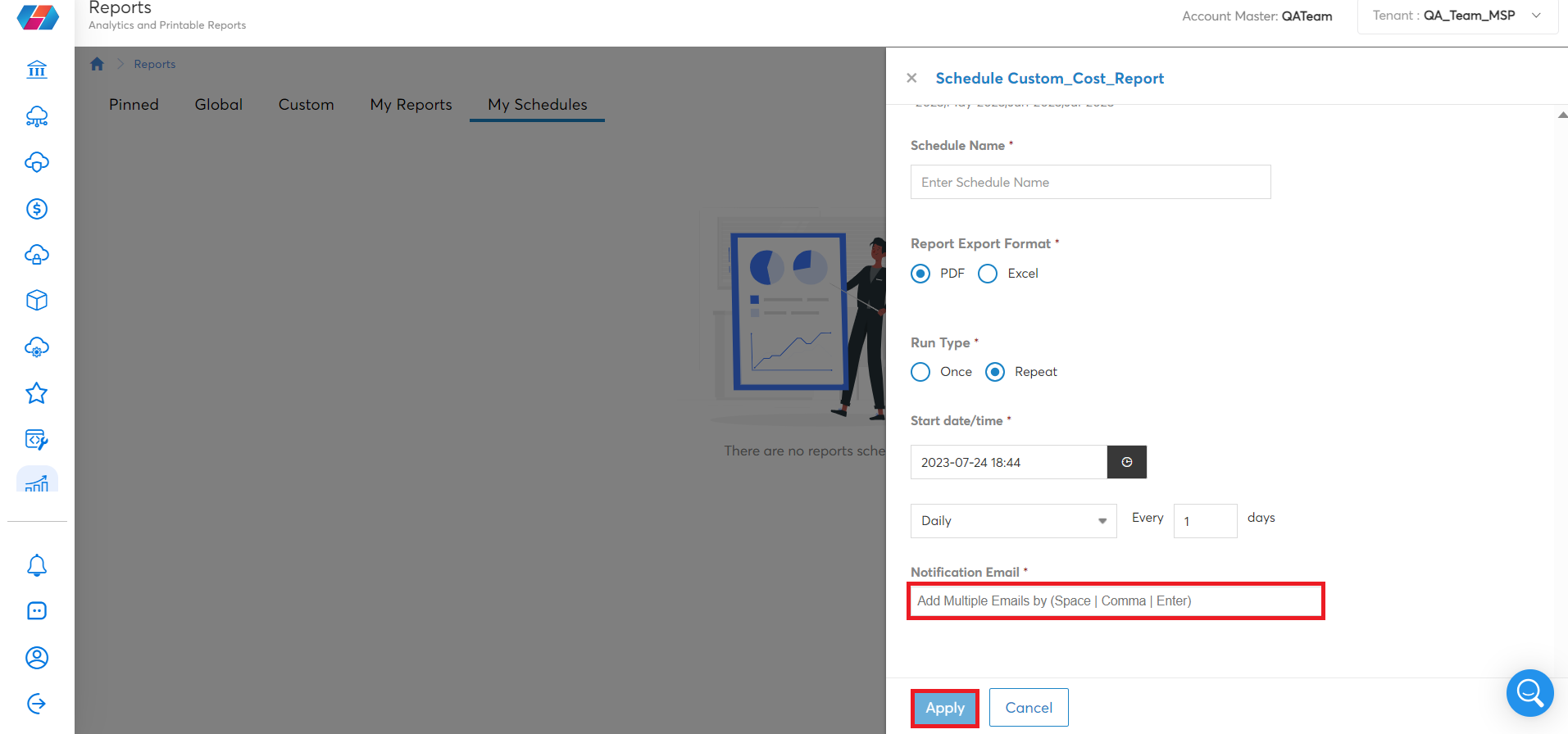
- In the Notification Email box, type the email ID of the user to whom the report will be sent as per the schedule set above and click Apply.
When to use Subscribe vs Share Report
Subscribe to a Report
The Subscribe option is used to subscribe to Paginated SSRS Reports. Refer here to follow the steps to subscribe to a report. You cannot subscribe to Analytics Reports and Paginated Analytics Reports.
Let us take an example. If you want to subscribe to the Custom Cost Report, then:
- First navigate to Reports > Cost > Multi-Cloud > Cost Reports > Custom Cost Report.
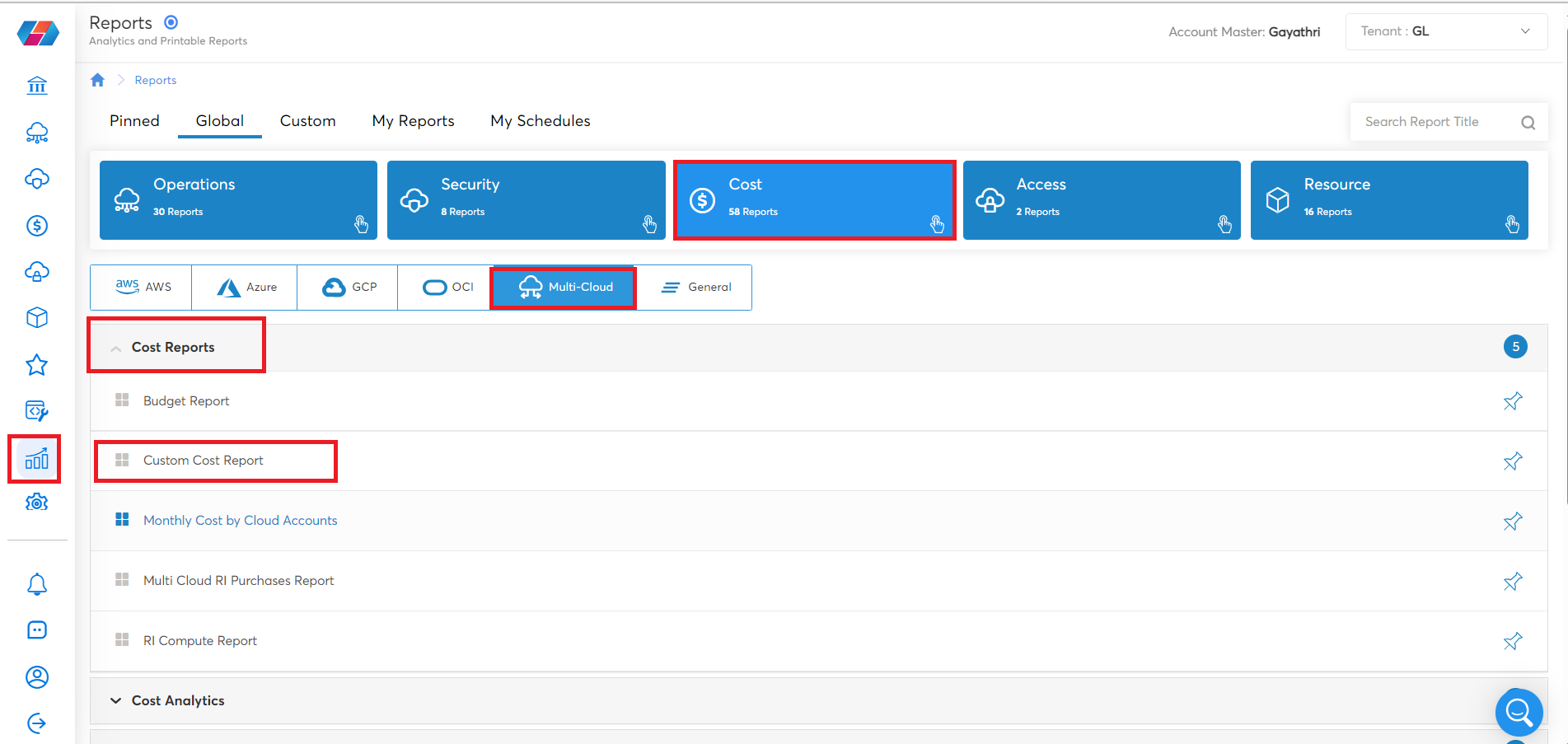
- After the report screen opens, select the required values for the parameters, and then click VIEW REPORT. You can now view the report as per the selected values.
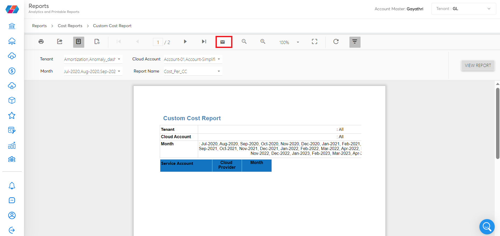
- To subscribe to the report, click the Subscribe icon. Follow the steps to Subscribe to SSRS Reports. Based on the frequency selected, you will receive the report.
Note:
The Share option is not available for Paginated SSRS Reports.
Share a Report
The Share Report option is used to share Analytics Report, also called as Power BI Reports. Follow the steps here to share a report.
Note:
You cannot share Paginated Analytics Reports and Paginated SSRS Reports.
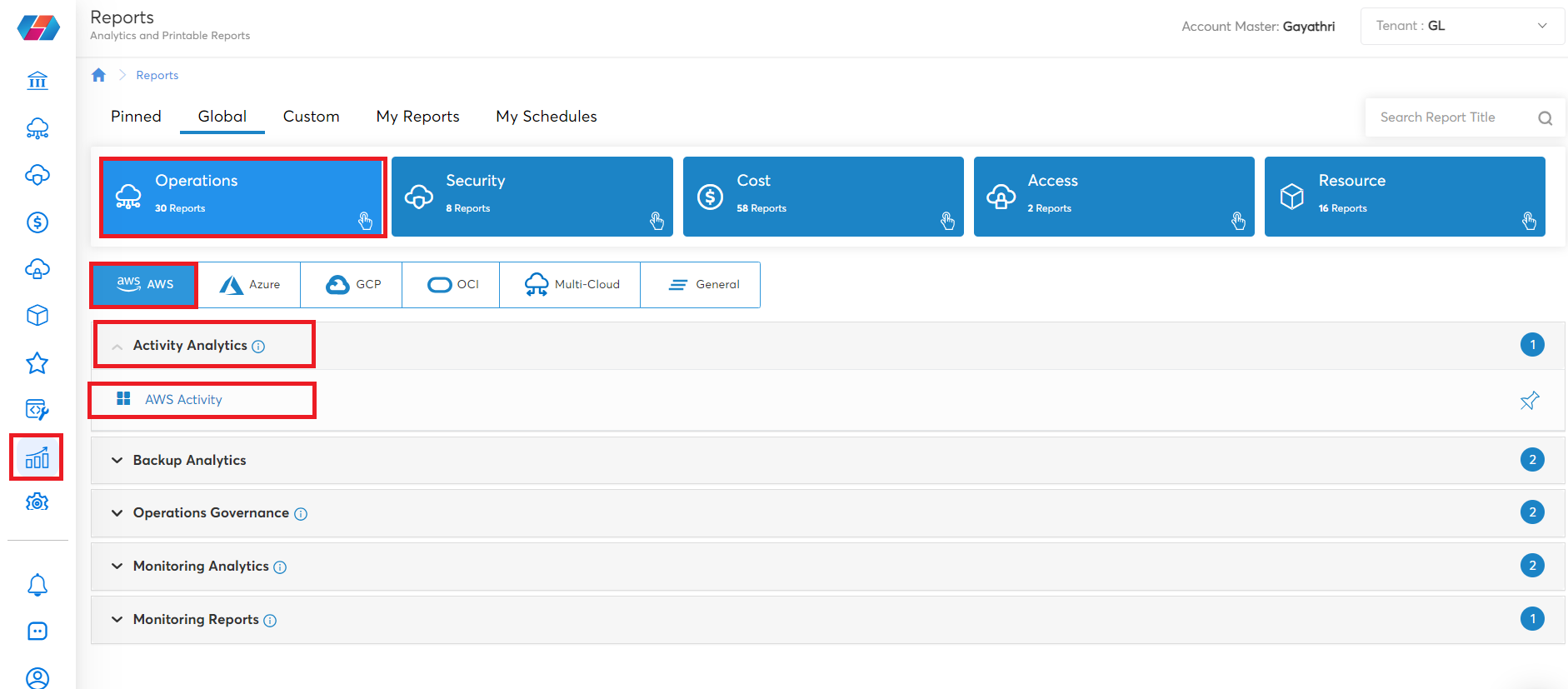
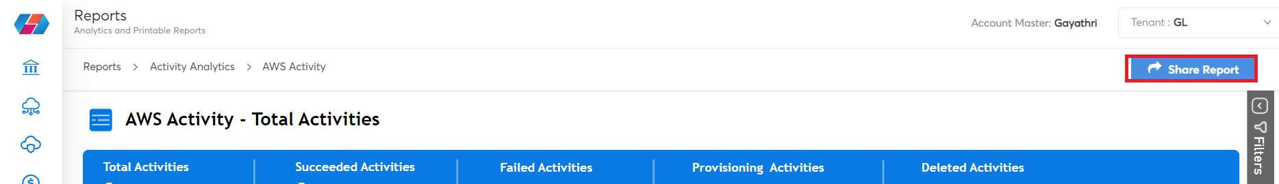
Let us take an example. If you want to share the AWS Activity report, then:
- Navigate to Reports > Operations > AWS > Activity Analytics > AWS Activity.
-
On the report screen, you can select and apply the required options to view report details. For example, if you want to view the report for a particular resource type, then you can select that resource in Resource Type list from the right-vertical Filters pane.
-
After all the required options are selected, to share this report, click Share Report. Follow the steps to Share Reports.
Note:
Analytics Reports can only be shared. There is no option to subscribe to these reports.
Navigating Options Within Analytics Reports
There are many navigation options available within analytics reports. Users can use the available options as per their need. Refer to the following steps to understand when users must use the different options available within the analytics report.
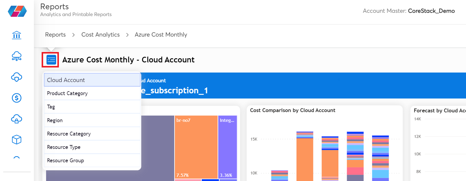
- Navigation: The blue icon on the left of the analytics page is used for navigating to different views available for a particular report. For example, click the blue icon and select Product Category to view the report as per the available product category.
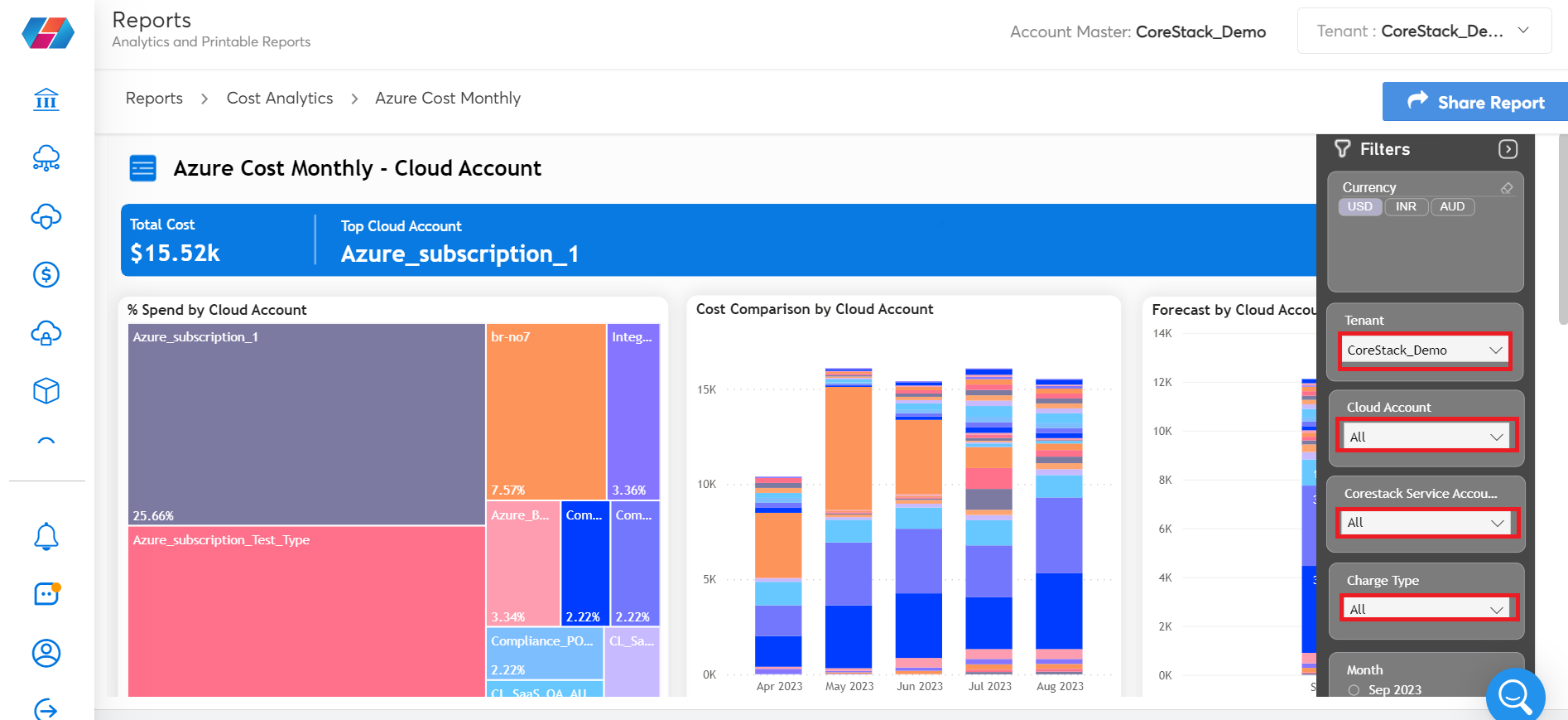
- Filter: After you select the report view on which analysis needs to be done, you can use the Filters pane on the extreme right side of the screen to drill down further in the report.
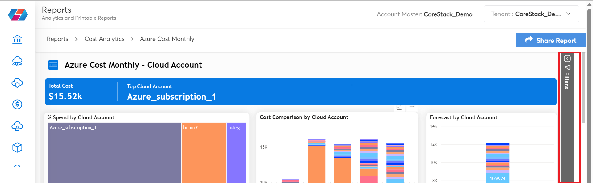
For example, users can click Filters to view the available filtering options related to the navigation view they have selected. Users can then select the relevant values for the fields that are displayed and view the report details. This helps users to slice and dice the data as per their requirements.
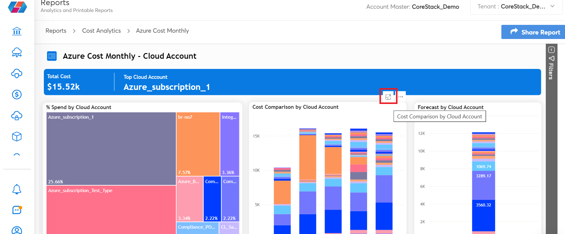
- Widget options:
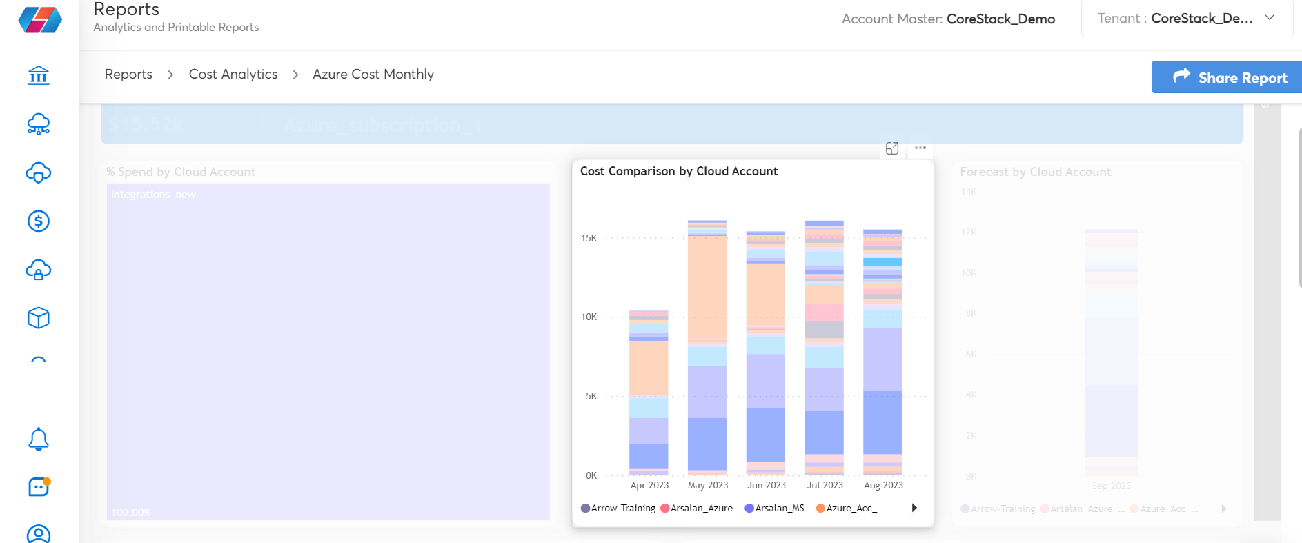
- Focus Mode: This option helps users to expand a particular widget to a full screen view.
- More Options (three horizontal dots): When users click the three dots icon, they get multiple options to select from.
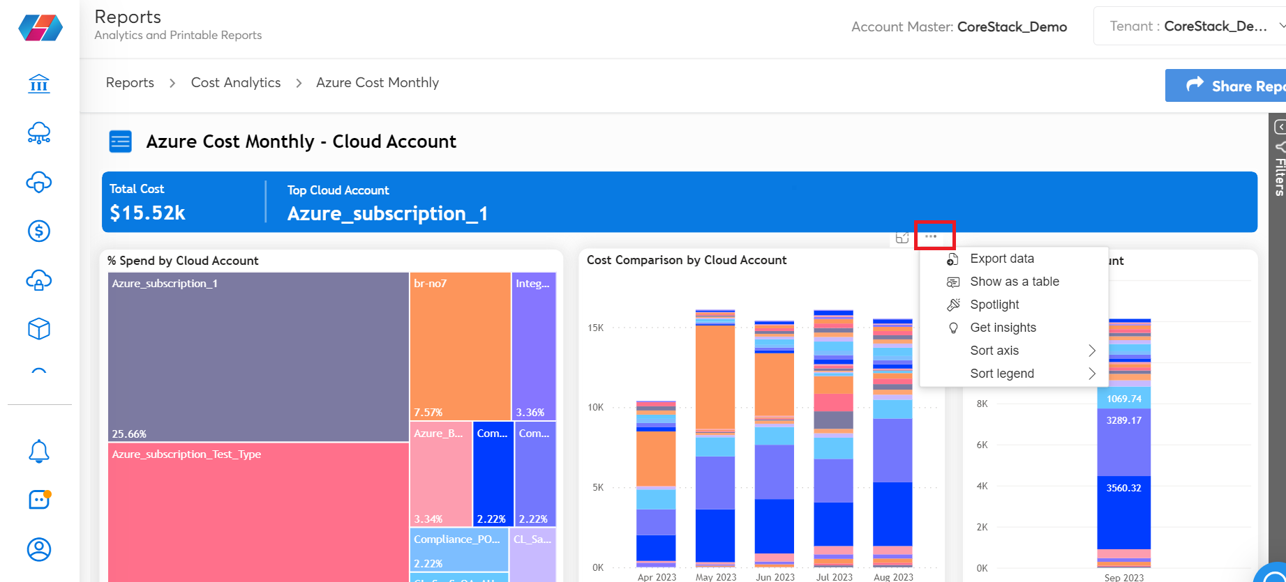
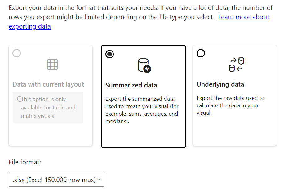
- Export Data: Select this option to export data from the grid table view in an .xlsx or .csv format. You can choose to download the same in either standardized format or raw format.
- Show as a Table: Select this option to view a particular widget as a data table along with the chart.
- Spotlight: This option helps to highlight a particular widget on the screen and fades out the other widgets.
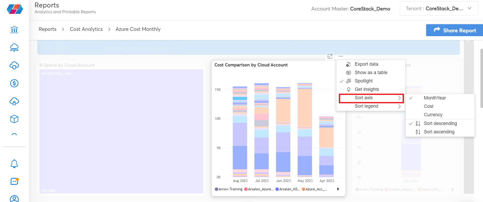
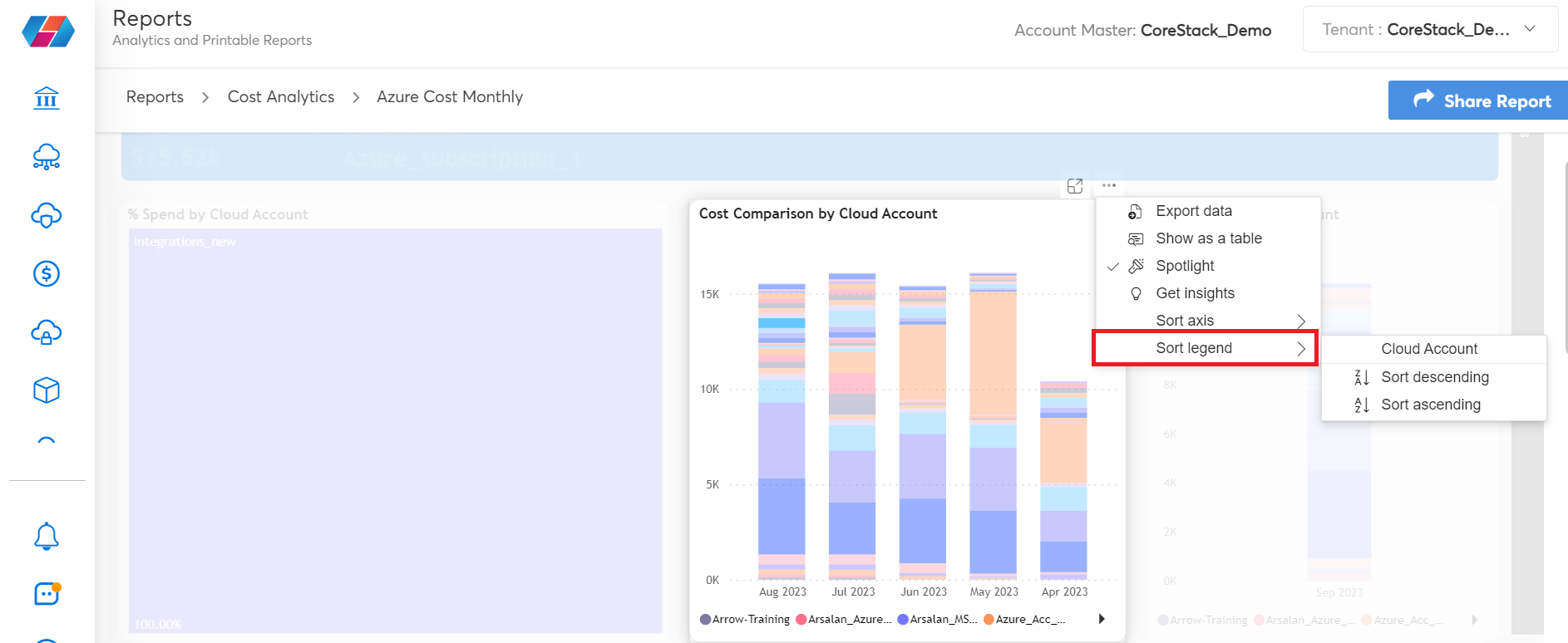
- Sort axis: This option is used to sort the data on the widget based on the axis. For example, if users want to sort the data according to the cost or by month, they can use the sort axis option whenever available.
- Sort legend: This option is used to sort the data on the widget based on the legend. If there are legends available for the data, then those can be sorted from ascending to descending and vice versa.
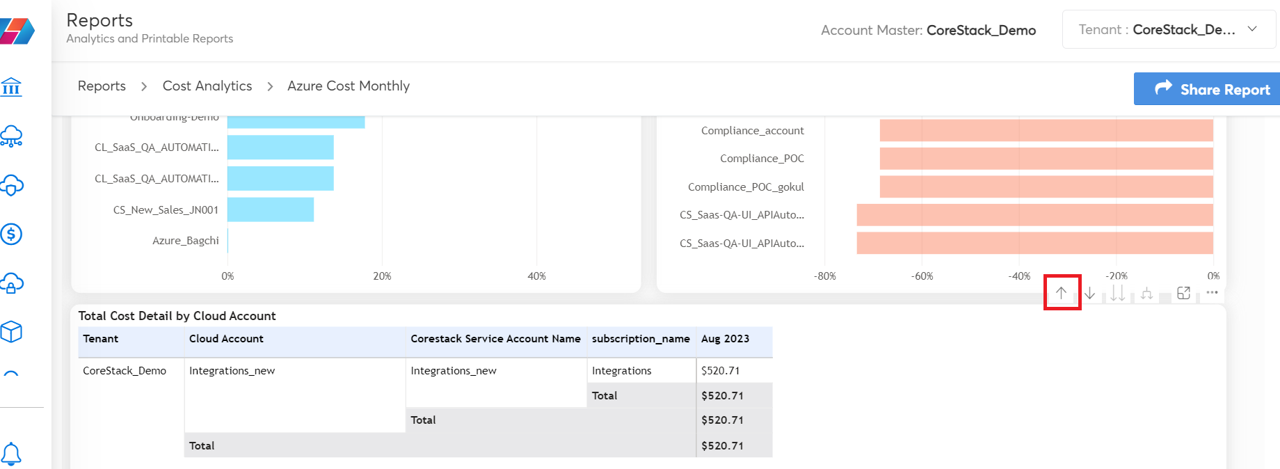
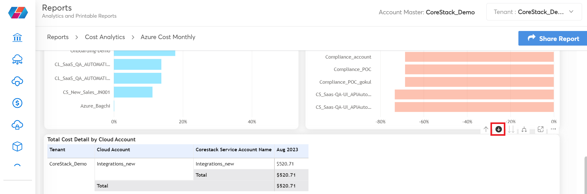
- Options on the table grid:
- Drill Up: Use this option to hide columns and get the desired view. For example, the grid table will have many columns showcasing data and there can be a long scroll on the right side of the grid table. In such cases, the Drill Up option can be used to hide the columns, which can help truncate the grid table and get the desired view.
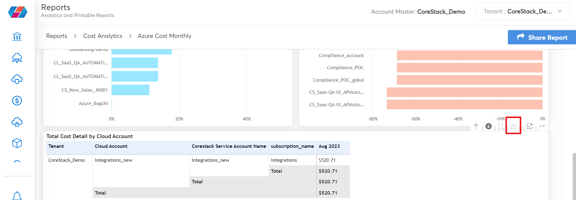
-
Drill Down: This option helps to drill down into any specific data on the analytics report. When users click on the Drill Down symbol, the drill down mode will be turned on and they can click any data point on the analytics chart. This will now show the drill down report details.
For example, in the report shown below, the drill down mode is on and the user has clicked Azure subscription_1 data point. This will enable only data relevant to Azure subscription_1 to be displayed on all widgets and in the table grid.
- Expand: This option helps to get back to the original view (with all the columns) on the grid table, that is, this option is used to undo the changes that are brought in by the drill up option.
Updated 5 months ago